In part 1 of this article, I made a quick and handy definition of user interface: Given technology as a black box, user interface is how you tell the black box what you want it to do. In part 2, I listed some things wrong with the current state of user interface, using Google as a prime example.
So we clearly haven’t yet mastered the science of user interface here in the 21st century. But what is it we’re striving towards? What’s the perfect user interface? In, say, a thousand years, when we have unlimited computing power and unlimited energy (like the characters of my novels Infoquake and MultiReal), what kinds of user interface will we be using?
 Let’s take the question one necessary step further: do we really need user interface at all? Or are we evolving toward the point where intelligent tools automatically understand what we’re trying to do? In a thousand years, will the concept of giving commands be obsolete?
Software developers are taking the first tentative steps in that direction now. Apple’s Steve Jobs has always taken that “benevolent dictator” approach: we’ll decide what you, the user, need to handle, and the machine will just automatically handle the rest. Take disk defragmentation, a software task that only the wonkiest of technowonks has any interest in controlling. There isn’t any standard disk defragmenter for Macs, but that’s not because Mac hard disks never need defragmenting. OS X simply does it for you behind the scenes, as this article on the Apple website makes clear.
Microsoft is moving in this direction too. One of the advantages that Windows users have historically held over Mac users is the fact that it’s generally easier to get under the hood and tweak the gears that make the system work. But that’s going away. Not only because OS X has brought command-line tweaking to the Mac, but because Vista is taking away a lot of tweakability from Windows. Disk defragmentation under Vista is a simple on-off proposition; flip it on, and the OS will handle it as needed. Likewise, throughout the operating system, interfaces that were once cluttered with hierarchical menus and interactive dialog boxes are giving way to much smaller lists of context-sensitive tasks. (For more of my thoughts on this, see old blog posts Don’t Worry, Vista Will Handle It and Look Ma… No Program Menus!)
It’s the same long-term trajectory of user interface we’ve seen in automobiles. Look at the user interface for the Model T (pictured, below; original photo, with explanations and more detail, here). Most modern automobiles have reduced this to a standard set of four controls — the gas, the brake, the steering wheel, and the gear shift. It’s not that the car doesn’t still need all those functions, but now the car handles everything itself. It’s not exposed to the end user. If you believe the so-called experts, we’ll all be zipping around in self-driving robot cars within a generation.
 Follow this trend several hundred years, and where does it lead? I talked previously about elevators that automatically know which floor you’re going to via RFID chips in your apartment keys. Why couldn’t that work elsewhere? Maybe you’ll pull into the Starbucks parking lot and find your usual soy milk decaf latte waiting when you get up to the counter. Maybe the refrigerator will automatically order more eggs from the store when you take the last two out. Maybe the polling station will know that you’re a member of the Christian Coalition and have a ballot all queued up with Mike Huckabee’s name checked when you get up to the voting booth.
There’s something very unsettling about these scenarios, and it’s not just the potential privacy hazards. Humans want to be in control of our environment; we instinctively resist environments that control us. Not only that, but we quickly grow bored with environments that coddle us. Humans are designed for dynamism, dissatisfaction, and change; despite the stereotype of modern man as couch potato, as a species we don’t handle stasis well.
So we like to be in control of our surroundings. But how much of this control is just feel-good illusion? When you order a hamburger at Burger King, sure, they’ll make it your way — as long as “your way” only involves their nine predefined toppings. And when you ask for lettuce, you can’t control how much, or whether they use shredded iceberg or delicately layered romaine, or whether it comes from West Virginia or Peru or Ecuador. Burger King’s real slogan should be “Have It Your Way, As Long As Your Way Falls Within the Narrow Parameters of Our Way.”
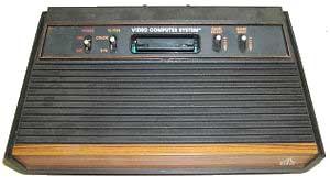
 1. Atari. The mass market videogame console was more or less invented by Atari in the late ’70s. Their only real competitor for years was Mattel’s Intellivision, which may have had vast technical superiority but had inept marketing. (George Plimpton? You’ve got to be kidding me.) But instead of innovating, Atari took the road of suing anyone and everyone who touched its much-beloved system. (Activision, Coleco, Starpath, Odyssey, Nintendo, Phillips, and Epyx all suffered Atari’s litigious wrath.) There was also a precipitous drop-off in videogame quality, as anyone who remembers notoriously bad media tie-ins like E.T. The original company was sold off many times and finally diluted to nothingness in the ’90s. The name still had such cachet, however, that Infogrames later licensed it for themselves.