When I set out to create the world for my Jump 225 Trilogy, as I’ve written elsewhere, I started with a few technological principles:
- Imagine that we have virtually inexhaustible sources of energy.
- Imagine that we have virtually unlimited computing power.
- Imagine that enough time has passed to allow the scientists to adequately take advantage of these things.
I discovered that starting from these basic principles, there are almost unlimited possibilities. You can easily have a world that’s intermeshed with virtual reality. You can create vast computational systems that have billions and billions of self-directing software programs. You can have pliable architecture that automatically adjusts to fit the needs of the people using it. And so on. It’s actually fairly easy to figure out a technological solution to just about any problem if you don’t have those constraints.
 The interesting questions in such a world, then, are questions of interface. You don’t bother to discuss if you can accomplish your goal anymore, because the answer is almost always “yes.” You just need to know how you’re going to accomplish it, and who’s going to pay for it, and what happens when your perfectly achievable goal clashes with someone else’s perfectly achievable goal.
In other words: you’re at point A. You’d like to be at point B. How do you go about getting there?
Note that when I’m talking about user interface, I’m not talking about how you actually get from point A to point B. The interesting thing about this whole new science of interface is that it doesn’t really matter. We can treat all kinds of science and engineering as a simple black box and just skip right over it. What I’m really concerned with at the moment is how human beings translate their desires into actions in the physical world. How do you tell the black box you want to go from point A to point B?
It seems like a ridiculously easy question, but turns out it’s not. Let’s just take a very simple example of a black box that we all know: the toaster. You might think we already have the perfect user interface for toasting bread. You stick bread in a toaster. There’s one big lever that turns the sucker on, and a dial that tells you how dark you want the toast. How can you improve on that?
Well, wait just a second — the desire we’re trying to accomplish here is to take ordinary bread and turn it into toast. And if you think of user interface as the way you go about accomplishing this, the user interface for toasting bread is much more complicated than you might think.
You need to buy a machine to do the toasting, and you need to plug that machine into a power socket. (The right kind of socket for your part of the world.) And not only do you need a bulky machine that takes up counter space, but you need a dedicated machine that really does nothing else but toast bread and the very small number of specialty foods designed to fit in toaster slots. If you’re trying to toast bread in my house, you need to know that the toaster and the microwave are plugged into the same outlet, and using them at the same time will blow the fuse. You need to experiment with every new toaster you buy to find exactly the right setting — and yet, chances are that you burn toast at least once every couple months. How inefficient is all that?
 So going back to our world with inexhaustible energy and computing power, how would you want to make toast? Would you want to put the piece of bread on a plate, push a button, and instantly have perfect toast? Would you want to bio-engineer a plant that grows perfect toast? Or no, let’s take it a step further — do you want the interface to anticipate that you’re going to want toast and have it already prepared for you? Hell, let’s take it one last step: do you want to just imagine that you’re eating toast through some nanotechnological neural manipulation, when you’re really just eating a hunk of tank-grown nutritional protein supplement?
The science of user interface is a fairly recent branch of knowledge. I’m not sure when it first came into being, but until I find some other contrary piece of evidence, I’m going to guess that the origin of the concept of user interface roughly coincided with the creation of the microprocessor. Why then? Maybe it’s because that’s the point in human history where technology disappeared from sight. You may not understand how the combustion engine works or the ENIAC computer computes, but at least you can look at it. You can actually see how the controls you have interact with the mechanics of the thing. But a microprocessor — well, pop open the chassis of your computer and look at it sometime. It just sits there. (That spinning thing on top is just a fan to disperse the heat.) For all intents and purposes, it is a black box to you and me. Suddenly we can leave the engineering to the engineers and think about that black box from a whole other level.
So I’ve been thinking a lot about user interface, and I’ve been writing a lot of random stuff in random draft WordPress posts. Now I’m going to try to write it all down in some kind of cohesive order. Here are the main questions I’m hoping to explore over the next however-long-it-takes:
- What exactly do you mean by user interface? (this article)
- What’s wrong with the user interfaces we’ve got now?
- Do we need user interface at all?
- A quick overview of bad science fiction user interfaces and why they would never work in the real world
- What makes the perfect user interface?
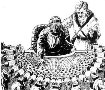
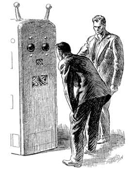
(For the insanely curious: the first illustration for this article is by illustrator Frank Paul, and according to this page, dates back to before the invention of the ENIAC; the second illustration, by Charles Schneeman, dates back to Astounding Science Fiction in 1941, according to this page.)
Update 1/31/08: Here’s part 2.
Update 2/10/08: Here’s part 3.