Building the Perfect User Interface (Part 3)

In part 1 of this article, I made a quick and handy definition of user interface: Given technology as a black box, user interface is how you tell the black box what you want it to do. In part 2, I listed some things wrong with the current state of user interface, using Google as a prime example.

So we clearly haven’t yet mastered the science of user interface here in the 21st century. But what is it we’re striving towards? What’s the perfect user interface? In, say, a thousand years, when we have unlimited computing power and unlimited energy (like the characters of my novels Infoquake and MultiReal), what kinds of user interface will we be using?

Apple iMac Let’s take the question one necessary step further: do we really need user interface at all? Or are we evolving toward the point where intelligent tools automatically understand what we’re trying to do? In a thousand years, will the concept of giving commands be obsolete?

Software developers are taking the first tentative steps in that direction now. Apple’s Steve Jobs has always taken that “benevolent dictator” approach: we’ll decide what you, the user, need to handle, and the machine will just automatically handle the rest. Take disk defragmentation, a software task that only the wonkiest of technowonks has any interest in controlling. There isn’t any standard disk defragmenter for Macs, but that’s not because Mac hard disks never need defragmenting. OS X simply does it for you behind the scenes, as this article on the Apple website makes clear.

Microsoft is moving in this direction too. One of the advantages that Windows users have historically held over Mac users is the fact that it’s generally easier to get under the hood and tweak the gears that make the system work. But that’s going away. Not only because OS X has brought command-line tweaking to the Mac, but because Vista is taking away a lot of tweakability from Windows. Disk defragmentation under Vista is a simple on-off proposition; flip it on, and the OS will handle it as needed. Likewise, throughout the operating system, interfaces that were once cluttered with hierarchical menus and interactive dialog boxes are giving way to much smaller lists of context-sensitive tasks. (For more of my thoughts on this, see old blog posts Don’t Worry, Vista Will Handle It and Look Ma… No Program Menus!)

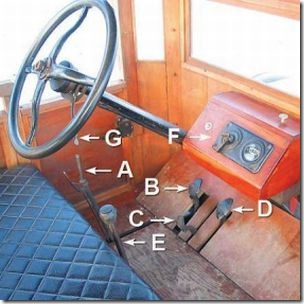
It’s the same long-term trajectory of user interface we’ve seen in automobiles. Look at the user interface for the Model T (pictured, below; original photo, with explanations and more detail, here). Most modern automobiles have reduced this to a standard set of four controls — the gas, the brake, the steering wheel, and the gear shift. It’s not that the car doesn’t still need all those functions, but now the car handles everything itself. It’s not exposed to the end user. If you believe the so-called experts, we’ll all be zipping around in self-driving robot cars within a generation.

Ford Model T ControlsFollow this trend several hundred years, and where does it lead? I talked previously about elevators that automatically know which floor you’re going to via RFID chips in your apartment keys. Why couldn’t that work elsewhere? Maybe you’ll pull into the Starbucks parking lot and find your usual soy milk decaf latte waiting when you get up to the counter. Maybe the refrigerator will automatically order more eggs from the store when you take the last two out. Maybe the polling station will know that you’re a member of the Christian Coalition and have a ballot all queued up with Mike Huckabee’s name checked when you get up to the voting booth.

There’s something very unsettling about these scenarios, and it’s not just the potential privacy hazards. Humans want to be in control of our environment; we instinctively resist environments that control us. Not only that, but we quickly grow bored with environments that coddle us. Humans are designed for dynamism, dissatisfaction, and change; despite the stereotype of modern man as couch potato, as a species we don’t handle stasis well.

So we like to be in control of our surroundings. But how much of this control is just feel-good illusion? When you order a hamburger at Burger King, sure, they’ll make it your way — as long as “your way” only involves their nine predefined toppings. And when you ask for lettuce, you can’t control how much, or whether they use shredded iceberg or delicately layered romaine, or whether it comes from West Virginia or Peru or Ecuador. Burger King’s real slogan should be “Have It Your Way, As Long As Your Way Falls Within the Narrow Parameters of Our Way.”

Read more

Building the Perfect User Interface (Part 2)

(Read Building the Perfect User Interface, Part 1.)

In my first ramble about user interface, I used the toaster as an example of something that is erroneously thought to have a perfect user interface. Perhaps a more apropos example for most techies is the Internet search engine.

Think of any piece of information you’d like to know. Who was the king of France in 1425? What’s the address and occupation of your best friend from junior high school? How many barrels of oil does Venezuela produce every day? Chances are, that piece of information is sitting on one of the trillions of web pages cached in Google’s databases, and it’s accessible from your web browser right this instant.

Google Is a Giant Robot illustrationYou just have to figure out how to get to it — and Google’s job is to bring it to you in as few steps as possible. It’s all a question of interface, and that’s why user interface has been Google’s main preoccupation since day one.

It might seem the model of simplicity to click in a box, type for a search term, and click a button to get your results. But the Google model of searching is still an imperfect process at best. You may not realize it, but there are still a number of Rubegoldbergian obstacles between you and the information you’re trying to get to. For instance:

  1. You need to have an actual machine that can access the Internet, whether it’s a computer or a cell phone or a DVR.
  2. That machine has to be powered and correctly configured, and it relies on hundreds of other machines — routers, satellites, firewalls, network hubs — to be powered and correctly configured too.
  3. You need to know how to log in to one of these machines, fire up a piece of software like a web browser, and find the Google website.
  4. The object of your search has to be easily expressed in words. You can’t put an image or a color or a bar of music into the search box.
  5. Those words have to be in a language that Google currently recognizes and catalogs (and your machine has to be capable of rendering words in that language).
  6. You have to know how to spell those words with some degree of accuracy — which isn’t a problem when searching for “the king of France in 1425,” but can be a real problem if you’re looking for “Kweisi Mfume’s curriculum vitae.”
  7. You need to be able to type at a reasonable speed, which puts you at a disadvantage if you’re one-handed or using imperfect dictation software.
  8. Google has to be able to interpret what category of subject you’re looking for, in order to discern whether you’re trying to find apples, Apple computers, Apple Records, or Fiona Apple.

Some of these barriers between you and your information might seem laughable. But it all seems so easy for you because you’re probably reading this from the ideal environment for Google, i.e. sitting indoors at a desk staring at a computer that you’ve already spent hours and hundreds, if not thousands, of dollars to set up. If you’re running down the street trying to figure out which bus route to take, the barriers to using Google become much steeper. Or if you’re driving in your car, or if you’re a Chinese peasant without access to 3G wireless, or if you’re lounging in the pool, and so on.

Even in the best-case scenario, after you jump through all those hoops, you usually have to scan through at least a page of results from the Google search engine to find the one that contains the information you’re looking for. Google does no interpretation, summarization, or analysis on the data it throws back to you. Some search engines do some preliminary classification of results, or they try to anyway, but it’s generally quite rudimentary. Chances are you’ll need to spend at least a few seconds to a few minutes combing through pages to find one that’s suitable, and then you’ll need to search through that suitable page to find the information you want.

I don’t mean to minimize the achievement of the Google search engine. The fact that I can determine within minutes that a) the king of France in 1425 was Charles VII, b) my best friend from junior high school is currently heading the division of a high-definition audio company in Latin America, and c) in 2004, Venezuela produced 2.4 million barrels of oil a day — this is all pretty frickin’ amazing. But that doesn’t mean we shouldn’t note the search engine’s shortcomings. That doesn’t mean we shouldn’t point out that there are still a zillion ways to improve it. There’s still a huge mountain to climb before we can call Google an example of perfect user interface.

But don’t worry, because Google’s on the case.

Read more

Building the Perfect User Interface (Part 1)

When I set out to create the world for my Jump 225 Trilogy, as I’ve written elsewhere, I started with a few technological principles:

  1. Imagine that we have virtually inexhaustible sources of energy.
  2. Imagine that we have virtually unlimited computing power.
  3. Imagine that enough time has passed to allow the scientists to adequately take advantage of these things.

I discovered that starting from these basic principles, there are almost unlimited possibilities. You can easily have a world that’s intermeshed with virtual reality. You can create vast computational systems that have billions and billions of self-directing software programs. You can have pliable architecture that automatically adjusts to fit the needs of the people using it. And so on. It’s actually fairly easy to figure out a technological solution to just about any problem if you don’t have those constraints.

science-fiction-machine.jpgThe interesting questions in such a world, then, are questions of interface. You don’t bother to discuss if you can accomplish your goal anymore, because the answer is almost always “yes.” You just need to know how you’re going to accomplish it, and who’s going to pay for it, and what happens when your perfectly achievable goal clashes with someone else’s perfectly achievable goal.

In other words: you’re at point A. You’d like to be at point B. How do you go about getting there?

Note that when I’m talking about user interface, I’m not talking about how you actually get from point A to point B. The interesting thing about this whole new science of interface is that it doesn’t really matter. We can treat all kinds of science and engineering as a simple black box and just skip right over it. What I’m really concerned with at the moment is how human beings translate their desires into actions in the physical world. How do you tell the black box you want to go from point A to point B?

It seems like a ridiculously easy question, but turns out it’s not. Let’s just take a very simple example of a black box that we all know: the toaster. You might think we already have the perfect user interface for toasting bread. You stick bread in a toaster. There’s one big lever that turns the sucker on, and a dial that tells you how dark you want the toast. How can you improve on that?

Well, wait just a second — the desire we’re trying to accomplish here is to take ordinary bread and turn it into toast. And if you think of user interface as the way you go about accomplishing this, the user interface for toasting bread is much more complicated than you might think.

You need to buy a machine to do the toasting, and you need to plug that machine into a power socket. (The right kind of socket for your part of the world.) And not only do you need a bulky machine that takes up counter space, but you need a dedicated machine that really does nothing else but toast bread and the very small number of specialty foods designed to fit in toaster slots. If you’re trying to toast bread in my house, you need to know that the toaster and the microwave are plugged into the same outlet, and using them at the same time will blow the fuse. You need to experiment with every new toaster you buy to find exactly the right setting — and yet, chances are that you burn toast at least once every couple months. How inefficient is all that?

Read more

My New Sony VAIO Laptop

So after flirting with the idea of buying a MacBook Pro for months, I went with Windows.

But I went with Windows in style.

A few days ago, I purchased a brand new Sony VGN-FZ140E notebook computer from the local Circuit City. (Here’s the laptop homepage on Sony’s website.) Circuit City had a deal which was pretty hard to pass up. For the incurably geeky, here are the specs on my new computool:

  • Sony Vaio FZ-140E laptopIntel Core 2 Duo T7100 processor running at 1.8 GHz
  • 15.4-inch widescreen WXGA LCD with reflective coating
  • Intel Graphics Media Accelerator X3100
  • 200 GB hard drive (only runs at 4500 RPM, unfortunately)
  • 2 GB of memory
  • Built-in wireless connectivity to 802.11a/b/g, and even n
  • Built-in webcam and microphone
  • DVD-/+RW drive, which I think has that cool LightScribe labeling thing
  • Slots ‘n jacks ‘n ports up the wazoo
  • Only 5.75 pounds, including battery
  • Windows Vista Home Premium

So why no MacBook Pro? It’s simple: the display for the regular ol’ MacBook is too frickin’ small, and the base model for the MacBook Pro is $2,000 before sales tax and shipping. What did I pay for my Sony? A nice, light $1,200 including sales tax.

And I have to say that this Sony almost matches that Apple cool factor. It’s extremely thin and light, and has this graphite coating that just begs to be caressed. The display is absolutely gorgeous, the brightest and clearest I’ve ever seen. So far, the machine’s been as quiet as a church mouse, it doesn’t heat up unnecessarily during normal use, and the Vista Aero graphics are pretty snappy. I’m not quite used to the keyboard layout yet, but the action is phenomenal — the keys are almost flat, like the MacBook’s, and they don’t clatter loud enough to wake the neighbors.

All in all, this should be powerful enough to do what I intend to do on this laptop. Which is plunk my ass down in a series of Starbucks and write Geosynchron, the third book in the Jump 225 Trilogy. There will be the occasional bit of web contract work on here, but again, I mostly reserve that for my desktop.

I’d gotten used to all kinds of inconveniences with my 2003 vintage Toshiba notebook. The lid doesn’t open and close properly, hibernation doesn’t work, there’s no built-in WiFi, and the thing vents out the bottom, so if you stick it on a cushioned surface it overheats and shuts down. Almost any new laptop I buy would solve those problems, but the Sony VAIO solved problems I didn’t realize I had. Like the fact that all of the ports are exactly where I want them to be, and the power jack includes an L-shaped connector that makes the cord take up less space.

So what are the immediate downsides I see to this machine?

  • The trackpad is a bit smaller than usual, and it’s almost completely flush with the rest of the casing. Seriously, it’s only recessed about a millimeter. This means that half the time I have to slide my finger around for a second or two to actually find the trackpad. It doesn’t help that the trackpad is black with black buttons, so it’s almost completely camouflaged. In low-light situations, you can barely even tell it’s there.
  • The sound is a lot tinnier than I expected. I probably should have gone for the model with the fancy-schmancy Harman-Kardon speakers, but I suppose it’s not really that big of a deal. I listen to most of my music on the desktop anyway, and if I’m going to watch DVDs I’ll be using headphones.
  • No Bluetooth. Which isn’t a tragedy for me, considering that I don’t really have any Bluetooth gadgets. But I was really hoping to start Bluetoothing my office so I can get rid of some of those wires. Guess I can always go buy an expansion card.
  • The integrated video isn’t powerful enough to let me run advanced games, which probably won’t be too much of an issue considering I do the little gaming I do on the desktop PC.

Read more

Don’t Worry, Vista Will Handle It

Call me a masochist, but I installed Windows Vista on my home machine this past weekend. I wasn’t about to spend much money to get my rapidly aging Shuttle XPC Vista ready, so I simply opted to buy an $85 ATI Radeon video card that would let me run the Aero interface, however creakily.

The list of apps with Vista compatibility problems is truly mind-boggling. We’re talking about stuff I use every day. Dreamweaver, ColdFusion, Eclipse, iTunes, Irfanview. Add to that the fact that my Photoshop disc is on the fritz and you’ve got a major productivity roadblock. But perhaps the app that I miss the most is one that works in the background: Diskeeper.

Diskeeper is (or was) probably the best defragmenter available for Windows. It’s got a feature called “Set It and Forget It” which allows you to configure the program to defrag your hard drive in the background whenever it sees the need, and then, as advertised, forget all about the damn thing. But the bastards at the Diskeeper Corporation want me to pay $30 to upgrade to their new Vista version, even though I already bought an upgrade less than six months ago. So I decided to look at alternatives. (Update 3/8/07: Never let it be said this blogging thing is a waste of time. I just received an e-mail from a nice fellow at Diskeeper Corp. apologizing for the upgrade confusion and offering to make it up with a coupla extra licenses. Thanks, Diskeeper!)

I opened up the built-in Windows Vista Disk Defragmenter, and I was astounded to see this:

Windows Vista Disk Defragmenter

In case you’re looking at this image and wondering what’s so astounding, the only thing you can configure here is the schedule. No setting priorities, no setting unmovable files, no program menus, no help file, no nothing. I wasn’t expecting a robust interface like Diskeeper’s that allows you granular control over what files get positioned in what place on the hard drive, but I wasn’t quite expecting this either.

Windows Vista is full of these kinds of user interface decisions. Places where the operating system presents you with a limited set of options and tells you, “don’t worry, Windows Vista will handle it.” We’ll defragment your disk for you, we’ll switch color schemes when necessary, we’ll block you from handling the nasty files, we’ll decide when the computer should sleep and when it should wake.

Remind you of anything? It reminds me of a Mac.

Read more

Look Ma… No Program Menus!

It’s pretty much official at this point: Microsoft is ditching program menus. By program menus, I mean that narrow bar at the top of every program in MS Windows which usually starts with “File” and ends with “Help.” These menus have been a part of day-to-day computing experience since the first Macs in the ’80s, and have a history that extends back to Xerox PARC in the early ’70s. And now Microsoft is putting them … Read more