(Read Building the Perfect User Interface, Part 1.)
In my first ramble about user interface, I used the toaster as an example of something that is erroneously thought to have a perfect user interface. Perhaps a more apropos example for most techies is the Internet search engine.
Think of any piece of information you’d like to know. Who was the king of France in 1425? What’s the address and occupation of your best friend from junior high school? How many barrels of oil does Venezuela produce every day? Chances are, that piece of information is sitting on one of the trillions of web pages cached in Google’s databases, and it’s accessible from your web browser right this instant.
 You just have to figure out how to get to it — and Google’s job is to bring it to you in as few steps as possible. It’s all a question of interface, and that’s why user interface has been Google’s main preoccupation since day one.
It might seem the model of simplicity to click in a box, type for a search term, and click a button to get your results. But the Google model of searching is still an imperfect process at best. You may not realize it, but there are still a number of Rubegoldbergian obstacles between you and the information you’re trying to get to. For instance:
- You need to have an actual machine that can access the Internet, whether it’s a computer or a cell phone or a DVR.
- That machine has to be powered and correctly configured, and it relies on hundreds of other machines — routers, satellites, firewalls, network hubs — to be powered and correctly configured too.
- You need to know how to log in to one of these machines, fire up a piece of software like a web browser, and find the Google website.
- The object of your search has to be easily expressed in words. You can’t put an image or a color or a bar of music into the search box.
- Those words have to be in a language that Google currently recognizes and catalogs (and your machine has to be capable of rendering words in that language).
- You have to know how to spell those words with some degree of accuracy — which isn’t a problem when searching for “the king of France in 1425,” but can be a real problem if you’re looking for “Kweisi Mfume’s curriculum vitae.”
- You need to be able to type at a reasonable speed, which puts you at a disadvantage if you’re one-handed or using imperfect dictation software.
- Google has to be able to interpret what category of subject you’re looking for, in order to discern whether you’re trying to find apples, Apple computers, Apple Records, or Fiona Apple.
Some of these barriers between you and your information might seem laughable. But it all seems so easy for you because you’re probably reading this from the ideal environment for Google, i.e. sitting indoors at a desk staring at a computer that you’ve already spent hours and hundreds, if not thousands, of dollars to set up. If you’re running down the street trying to figure out which bus route to take, the barriers to using Google become much steeper. Or if you’re driving in your car, or if you’re a Chinese peasant without access to 3G wireless, or if you’re lounging in the pool, and so on.
Even in the best-case scenario, after you jump through all those hoops, you usually have to scan through at least a page of results from the Google search engine to find the one that contains the information you’re looking for. Google does no interpretation, summarization, or analysis on the data it throws back to you. Some search engines do some preliminary classification of results, or they try to anyway, but it’s generally quite rudimentary. Chances are you’ll need to spend at least a few seconds to a few minutes combing through pages to find one that’s suitable, and then you’ll need to search through that suitable page to find the information you want.
I don’t mean to minimize the achievement of the Google search engine. The fact that I can determine within minutes that a) the king of France in 1425 was Charles VII, b) my best friend from junior high school is currently heading the division of a high-definition audio company in Latin America, and c) in 2004, Venezuela produced 2.4 million barrels of oil a day — this is all pretty frickin’ amazing. But that doesn’t mean we shouldn’t note the search engine’s shortcomings. That doesn’t mean we shouldn’t point out that there are still a zillion ways to improve it. There’s still a huge mountain to climb before we can call Google an example of perfect user interface.
But don’t worry, because Google’s on the case.
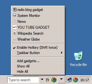 Google has been making a mighty effort to break out of the web browser for quite some time. Not only have they been pushing their browserless Google Desktop app for some time, but they’re also quite open in publishing their APIs and trying to get you to hook into Google from other places. Cell phones, iPhones, car dashboards, public kiosks, refrigerators, digital chopsticks, Bluetooth-enabled dog collars, etc.
Why? A few years ago, we might have said that they were trying to escape the monopolistic grip of Microsoft and its Internet Explorer browser. But now that Firefox has made serious inroads on IE’s dominance — they’ve got around 16% global market share, 20% North American market share, and 30% European market share, if you believe the latest statistics — it’s not such a big concern.
No, the main reason Google’s looking for new avenues for search is that the standard WIMP (Window, Icon, Menu, Pointing Device) user interface is a dinosaur, and right now it’s late the Cretaceous Period and there’s a big fucking meteor zipping across the sky.
Forget about the distinctions between Mac, Windows, and Linux — they’re all inefficient. While some computer operating systems may work more smoothly than others, they’re all based on the principles developed by Stanford researchers and Xerox PARC engineers in the late ’60s and early ’70s.
What’s wrong with the WIMP interface? It’s a nice all-purpose interface for general tasks, but it falls down on the job on just about any specific task you give it. As software has grown more complicated, the WIMP interface has failed to keep up. Programs like Microsoft Word have become mazes of hierarchical menus and drill-down dialog boxes, and operating such programs efficiently has become an exercise in rote memorization. Shoehorning the computing power of a 2.4 GHz dual-core processor into seven or eight subcategories and a row of increasingly tiny icons is kind of like running an M1 Abrams tank off an Atari 2600 joystick. You’re wasting potential.
Software manufacturers are now toying with a host of WIMP extensions and alternatives like the Office Ribbon, which try to unearth options that had been buried four menus deep for years. And while the Office Ribbon is pretty nice, it’s ultimately limited. You’re still dividing up a list of possible tasks into seven or eight subcategories, and expecting users to drill down to find the item they’re looking for. The Ribbon works fine for Office 2007, but it’s certainly not going to cut the mustard in Office 2020 (if such a thing even exists then).
 But let’s take things one step further. Forget the WIMP interface — the computer itself is just an intermediate step, headed soon for the great Recycle Bin in the Sky.
As the MacBook Air has demonstrated, the physical machine itself is disappearing. People have been talking about the concept of “wearable computing,” and experimenting with gadgets like the Senseboard, which allows you to project a virtual keyboard and type on any surface you like. Computer manufacturers are looking at the mouse and realizing, heck, you don’t need an intermediate plastic device that represents where you want to point on a computer screen. You can just touch the damn thing yourself and make it do what you want. Thus the creation of Microsoft Surface and devices like the iPod Touch.
The point I’m trying to make with all this is that we’re still in the Dark Ages in terms of user interface. You may feel pretty content with your little plastic box showing little two-dimensional pictures on a little 17-inch screen. But it’s just an interface, and a ridiculously inefficient one at that, and it’s going away. Soon.
So if computers are going away, where do we go from here? Do we still need user interface? Coming in the next article…
***
(Of course, let’s not forget that all this time I’ve just been talking about one very narrow application of user interface, and that’s interface as a gateway to information technology. But what about user interface in the real world? After all, your car’s got a user interface, your hedge clippers have a user interface, your TV has a user interface, and so does every elevator you’ve ever ridden.
(Take the standard elevator. Elevators are extremely dumb machines. They spend large amounts of time sitting on the wrong floor. When you walk up to the elevator, the only interface you’ve got is a simple two-button panel that asks whether you’re going up or down. People often end up piling into multiple elevators that are going to the same destinations, requiring all of the elevators to stop at multiple floors. The buttons for opening and closing the doors once you’re in there are a bad joke — by the time you find them, it’s either too late to stop the doors or just an unnecessary extra redundancy.
(How come the elevators don’t know where you’re going already? If you’re in a strange building, that’s understandable — but why should you have to push the same button for your apartment or office every day? Couldn’t the building automatically sense that someone’s waiting for the elevator via motion detectors? And couldn’t it automatically sense which floor you’re heading to by reading an RFID chip in your key? Hell, the elevator should start making decisions about which elevator to send and when as soon as I enter the parking garage.
(So just like computers, these real-world interfaces are rife with inadequacies too. They’re just waiting for a revolution in user interface.)
***
(Sources for the images in this article: “Google Is a Giant Robot” by Stuart Brown; screen cap of Google Desktop from the unofficial Google Operating System blog; and the original WIMP interface for the Xerox Alto, circa 1973, from the Encyclopedia Britannica.)