I’ve got a new part-time job, and along with that job came a brand-new Dell PC. (Along with it also came a hellacious commute that’s eating up my free time, thus explaining the lack of blogging lately.)
The new PC is a monster: Dual Core 2.66GHz processor, 3.5GB of memory, a screamin’ video card, and a 360GB hard drive. Not to mention a 24-inch flatscreen monitor big enough for me to view satellite images of entire U.S. states and still be able to make out your house. (Yes, your house. I’m watching you right now, in fact. Does your mother know what you’re doing?)
So the PC is fabulous, but the Windows Vista Ultimate Edition that came pre-installed? Not so fabulous. It’s a shame, because I generally like Microsoft products. Yes, the company’s got its problems — they’ve been guilty of many sins over the years, including bloatware, vaporware, crippleware, and bullying behavior — but overall I believe Microsoft has done about as good a job running 95% of the world’s computer desktops as one can reasonably expect a company to do.
Here are my first impressions of the good stuff and the bad stuff with Windows Vista:
First, the bad stuff:

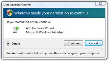
- User Account Control sucks. Yes, Windows Vista’s new access controls are just as bad as you’ve heard. I don’t mind the concept of clicking through approval dialog boxes when I’m doing something that could potentially disrupt my system. The problem is that Vista gives you multiple dialog boxes, sometimes three or four in a row. You’ll get a dialog box saying that you need to give Windows permission to continue — and then you’ll get another dialog box actually asking for your permission to continue. Wha? It doesn’t help that these dialog boxes are poorly designed so it’s difficult to see at a glance what you’re trying to approve or deny. (See above.)
- The Sidebar sucks. Well, perhaps it’s not the Sidebar itself so much as the gadgets that ship with the Sidebar. Sidebars are great in theory, as Apple users (and Google Desktop users) (and Yahoo! Widget users) can attest. But the built-in gadgets that come with the OS are terrible. You can’t resize them. You can’t cut and paste from them. You can’t sort them. You generally can’t right-click on them. And there are generally only one or two options for customizing them. Why would I want a postage stamp-sized display of four RSS articles that I can’t sort, resize, cut-and-paste, e-mail, or bookmark?
- The new Start menu sucks. I can understand why some people would get irritated with the scrolling menu hell of Windows XP. But with the new Vista Start menu, programs are simply hidden, and you end up using the Search feature all the time. There’s much less visual clutter, but things don’t feel any better organized. Plus… why is it that with a smokin’ nVidia graphics card and over three gigs of RAM, it still takes TEN FUCKING SECONDS for the Control Panel menu to cascade off the Start menu EVERY FUCKING TIME? Honestly, people.
- The new Explorer windows are confusing. Explorer windows really should come in two sizes: one standard size for browsing files in a stand-alone app, and one standard size for browsing files in open/save dialog boxes. But there are so many options now that I’m easily confused. The different configurations appear to be somewhat random — sometimes you’ll get a super-compact save dialog, sometimes you’ll get an extended dialog with all of the folders and favorite places in it. Come on, dudes — I don’t need to compile a C++ program here, I just need to find the file I’m looking for so I can open or save it.
 Aero transparency is confusing. Sure, the new look and feel is very clean. But the transparency effect on all of the toolbars and window edges leaves something to be desired. I often find myself in the situation where the windows underneath the top level are darker than the window that’s on top. I’ll often be staring at a stack of windows and click on the wrong one, because I simply can’t tell which one’s the active window. (See screen shot to the right.) (One good thing about Aero is that the aliasing effect you’d get in earlier versions of Windows where part of a window would remain onscreen for a few seconds even after you moved it is gone.)
- You’re going to get compatibility problems. Some of my standard apps, like the Eclipse software development environment, the Irfanview freeware image viewer, and Virtual PC, won’t install correctly or only run with certain limitations in Vista. For instance, every time I try to open Eclipse, I get a warning message asking me if I know what this piece of software is and if I trust it. If there’s a way to permanently trust a piece of software, I haven’t figured out how yet.
- First Boot Window Explosion Hell. I don’t know if there’s a term for the explosion of crap you get when you boot up a new system for the first time, but there should be. Booting up Vista for the first time, I was bombarded with a gajillion messages and dialog boxes that took me ten minutes to sort through. Anti-Virus isn’t installed! The Roxio software that came with your Dell isn’t working properly! You’ve got important Windows Updates to install! Here’s an introduction to Vista! Blah blah blah. Shut up and let me get to work already.
I don’t want to leave anyone with the impression that Vista is all bad. There are some good features that will make my life easier:
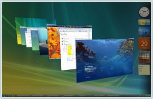
 3D Flip is cool. The 3D flip thing is a lot more useful than it sounds. It’s very helpful to be able to scroll through your running applications by seeing 3D thumbnails of them. Plus it’s remarkably quick. (At least it is on my system. I’d hate to see how it runs on my home desktop.) If you’re not up for 3D flip, the old-fashioned Alt-Tab flipping is much improved as well — and even running your mouse over the items in the taskbar gives you live thumbnails of your running apps.
- The RSS store is cool. All of the RSS feeds you subscribe to through Internet Explorer 7 don’t get stored in the browser, but rather sit in a common RSS feed store that other applications can access. So the feeds you subscribe to IE7 will automatically appear in Outlook 2007 and your Sidebar gadgets. Unfortunately, there aren’t many apps that can tap into this right now, but eventually it’ll be a good thing. This RSS store will also propagate with you if you have, say, a roaming profile, which means you’ll be able to take your RSS feeds with you to any Windows desktop. In theory.
- The Network and Sharing Center is cool. Networking has always been extremely cryptic in Windows. It’s amazing how much hassle you need to go through just to get a wireless network up and working in XP. I haven’t tested the wireless capabilities of Vista yet, but the general networking controls are much simpler and more intuitive. Vista will actually draw out a cool little network diagram for you, including the routers and hubs, that can help you figure out the lay of the land.
- Help has improved. It’s been a long time since I’ve spent any time in the Windows Help files. Now with Vista, I find myself running to the system help every few minutes trying to find out how to do something in the new UI that I was used to doing in the old UI. Microsoft’s obviously spent some time cleaning up the Help system and making it more comprehensible, and I seem to be finding answers much quicker now.
- Better folder organization. No more “Documents and Settings” folder — now all of your personal settings are stored in the much more intuitive “Users” folder. Under that are clearly labeled folders like “Documents,” “Desktop,” “Contacts,” “Favorites,” and “Mail.” And yes, if you use the built-in Windows apps, contacts and e-mails are actually stored in individual files, as they should be, rather than in an easily corruptible database. (If you’re using Outlook 2007, however, you’re SOL.)
So overall, I’d say that Windows Vista is… okay. Perhaps a B-minus or a C-plus. I expect that as I learn the ins and outs, I’ll get used to it and my opinion will improve. Let’s hope so. I spend too much of my day in front of computers to dislike my operating system.