The Jukebox in the Sky

Fortune Magazine’s David Kirkpatrick recently took a gander at the iPhone hype and concluded that the Apple model of music distribution is a thing of the past. “I doubt most people will want to buy or ‘own’ music at all,” writes Kirkpatrick in his article Looking Beyond the iPhone. “It will be far more useful to pick from a giant online library and listen to whatever we want wherever we are.”

The author then goes on to hold up as a model for the future RealNetworks’ Rhapsody service, which RealNetworks CEO Rob Glaser calls “the jukebox in the sky.” It sounds like a great deal: $10 a month for all the streaming music you can listen to. The catch is that you don’t get to own any of it; everything resides on the Rhapsody servers, you’re just checking it out for a few minutes.

Jukebox with wingsLet’s put aside the fact that RealNetworks’ products turned into clunky, adware-laden pieces of crap several years ago with the release of their RealOne player. Let’s also put aside the fact that the company has lost so much ground in recent years to Apple’s iTunes and Microsoft’s Windows Media that they hardly have the clout to revolutionize the music business anymore.

The real (Real) question is this: Do people want a jukebox in the sky?

Kirkpatrick points to the coming ubiquity of wireless broadband networking. Within the next ten years or so, we’ll all be using 3G or WiMax or some as-yet-unchristened technology to access information anytime, anywhere. You won’t need to bring your music with you on little metallic discs — or little plastic iPods — because it will all be available for the taking on the big jukebox in the sky. Why pay to “own” music at all when downloading it is effortless? Just download what you want, when you want.

But here’s the problem with that scenario. Broadband access isn’t the only technology that’s growing by leaps and bounds. Disk storage is exploding too, and getting cheaper by the day.

As I write this, I’m looking at a last-generation iPod sitting on my desk with 30 GB of storage. Not quite enough to store my whole music collection yet — I rip my MP3’s at a full 320 Kbps, as God intended them to be ripped — but the newer 80 GB iPods might do the trick. Within a few years, we’ll be carrying 500 GB iPods. Seagate and Hitachi have 1 terabyte hard drives coming out this year. Flash memory is getting so cheap that you can find piles of thumb drives sitting next to the check-out counter at computer stores.

Guess how much data the entire printed Library of Congress contains? 10 terabytes. Yes, that’s it, 10 terabytes. Assuming we continue along this exponential trend of increased storage, you’ll be blowing your nose with 10-terabyte Kleenex soon enough. What does that mean? That means you’ll be able to carry your entire music, video, and book collection around in your pocket in 20 years. Let’s take it even further: in 40 or 50 years, you’ll be able to carry around every book ever written and every piece of music ever recorded around with you. Give it another 10 years for video.

So would you rather carry your digital media with you in your pocket, or would you rather carry your radio receiver with you and access your media on the great jukebox in the sky?

Read more

Share This: A WordPress Plug-in

[Quick reminder before we get underway: my Jewish Marxist Werewolves in Bolivia Infoquake giveaway contest is still open! Deadline is this Friday, and lots of opportunity for you — yes, you — to win a signed copy of the book.]

I’ve nearly completed all the modifications I wanted to make on this blog for 2007. Finally this weekend I cleared one of the last remaining hurdles: a good hook to social bookmarking and Web 2.0 sites.

I found that hook with Alex King’s Share This plug-in for WordPress.

Screen shot of Alex King's 'Share This' plug-in

Look at the gray bar underneath the headline of any article on this site. Along with “permanent link,” “comments,” and “trackback,” there’s now a “share this” link. Click it and give it a whirl. (If you’re viewing this article on LiveJournal, MySpace, or SFNovelists, you can look at the screen shot to the right instead. Or view this article on my WordPress blog.)

The Share This plug-in is a godsend, because it eliminates the bane of so many blogs and websites these days: the growing clutter of Web 2.0 link buttons. We’ve all seen them. They’ve spread throughout the footers and sidebars of the World Wide Web like kudzu. Alex’s plug-in takes the whole kit-n-caboodle and tucks it nicely in a dynamic pop-up. Look, ma, no mess!

The list is fairly easy to configure if you’re comfortable editing a well-commented PHP document. You can use the list of other social web-type services found on 3spots’ list of blog footer buttons. Obviously I don’t have accounts with all these services, so all y’all blog readers will have to let me know if there’s a button that’s misbehaving. And let me know if there are any services I’m missing.

So far, the plug-in seems to be working extraordinarily well, and I can only hope it will allow my blog to continue to grow and dominate the blogosphere. Perhaps next year, I’ll look back at all the rival bloggers I’ve mercilessly slain on the field of Technorati and have Alex King to thank for it. (Hopefully Mr. King will even forgive me for grayscaling his nice standardized share icon.)

Of course, there’s always room for improvement, so I’m going to throw in my two cents about things I’d add or change in the plug-in.

Read more

The DADA Detective

I found a very nice little review of Infoquake the other day on the LiveJournal of a fellow named David Milloway. David calls Infoquake “a truly compelling and unique future setting that mixes programming, bio-genetics (or bio/logics) and economic theory. It reads kinda like a libertarian capitalist Dune, if you swap out the Spice for the Market, replace the dueling Houses with mega corporations, and think of Muad’Dib as less of a messiah and more of a cut-throat entrepreneur looking to make a lot of money.”

The DADA DetectiveAfter poking around a bit on the blog, I discovered that David’s part of a three-person team that produces the online comic strip The DADA Detective. (See the snippet to the right.)

It’s the ongoing tale of a hard-boiled detective hired by a rich heretical talking mime to find her missing duck, with the aid of the mad Doctor Victor von Phlogistein, who once created a geiger counter out of a muffin and who has a large hairy yeti as an assistant. Among the suspects in ze duck’s disappearance: Colonel Dijon; a dastardly masked fellow known as the Red Heron; and Peter Lorre.

There’s something oddly charming about this strip. Milloway and co-writer Matt Wood have a gift for non sequitur, with punch lines that range from wryly amusing to laugh-out-loud funny. The artwork (courtesy of Stephanie Freese) is part Edward Gorey and part Charles Schulz. And the whole thing is just addictive as hell. I started clicking through and got to episode 60 before I even looked up. (Start with episode 1 and you’ll see what I mean.)

Still not convinced these guys have talent? Then you simply must check out their Chocolypse Now, a mash-up of Willy Wonka and the Chocolate Factory and Heart of Darkness, including a candy-themed parody of T. S. Eliot’s The Hollow Men that made me snort up a mouthful of Coke Zero onto my keyboard.

I took the liberty of e-mailing David to try to get the scoop about the DADA Detective. The three behind the DADA Detective agreed to a micro-email-interview here on my blog. So here goes:

Q: Give me the quick and dirty background on the three of you.

A: Matt Wood, Stephanie Freese, and Dave Milloway have been good friends since college. Stephanie has a degree in painting. Matt and Dave are both English grads and comics nerds who somehow convinced Stephanie to get involved in illustrating a story that, god willing, will never again see the light of day. Despite that disaster, we’ve continued collaborating for nigh on 10 years now. Our work meetings get pretty silly sometimes, but we think that’s one of our strengths — our goofing around has produced our best ideas. See Chocolypse Now and the DADA Detective.

Q: You’re standing in an elevator when suddenly Neil Gaiman, R. Crumb, and Art Spiegelman all walk in. You tell them you’ve got this great online comic strip and they ask you what it’s about. What do you say?

Read more

Why Is Gmail So Irritating?

I switched over to Google’s Gmail about a year and a half ago from Yahoo! Mail, mostly because I wanted a change. I’m on Gmail about half of the time now, while the other half of the time I use Microsoft Outlook 2003.

I like Google. I have great faith in their ability to bring new technology to the masses in an intuitive, highly functional package. Google Maps quickly supplanted MapQuest as my street directory of choice when it came out. And I’ve got high hopes for Writely, an online word processing application that Google bought earlier this year and promptly rechristened Google Docs & Spreadsheets.

So why is Gmail so irritating?

Gmail logoGmail should be a slam-dunk for Google. After all, I can build a simple POP3 application on a ColdFusion web server in a couple of hours, and that includes time for me to consult the Macromedia documentation to fix my mangled CFML syntax. I’m not saying that that’s all there is to it, of course. (If you want to see a ColdFusion-based application gone horribly awry, look at all the flaws in MySpace.) But I don’t have some of the world’s best developers and billions of dollars in cash lying around either.

Here are my major problems with Gmail:

  • Gmail breaks the browser Back button. To me, this is an absolute cardinal sin. Yes, I understand how difficult it is to make a functioning web application that obeys the Back button in a stateless environment like the web. But certainly Google can do better. I back up into blank, non-functioning pages at least two or three times a day, usually when following links from the Gmail module on my Google home page. And when Google isn’t breaking the Back button, they’re opening up new and unwanted tabs in my browser.
  • Gmail breaks the Reload/Refresh button. Try opening an e-mail message, and then hitting your browser’s reload/refresh button. You get taken back to the list of e-mails. I get hung up on this several times a day too.
  • The interface is very, very slow. I lose patience very easily with the “Loading” messages that pop up at the top of the screen — there are actually two different messages, one that appears in the top right and one that appears in the top left — and they’re up there a lot.
  • No folders. Google assumes that we don’t care for the convention of filing our e-mail into different folders. Therefore Gmail does away with this metaphor altogether in favor of its own Label system, which I can’t seem to get used to. Couldn’t they at least give you the option of using folders, even if it’s not set by default?

Read more

A New Look for the Blog

You may notice that something looks a different on this website today. It’s a new theme for the blog that I’ve been tinkering with for the past couple months. So after much fiddling around in Photoshop, Dreamweaver, and WordPress, I’m ready to debut it to the world (though I might decide to revert back to the old one temporarily until I fix some of the kinks).

Why a new theme?

  • I wanted to make the blog a little more colorful and less visually boring
  • I wanted to display more information without sacrificing usability
  • I wanted to take out some of the old blog features and add some new ones

Some of the new features you’ll notice on the blog include:

  • Permanent links to the comments section of each article, and permanent links to each individual comment
  • Numbered comments that are a little easier to follow
  • Lefthand column with links to all my various websites, including stuff like my Flickr and MySpace pages
  • Slightly cleaner HTML behind the scenes
  • RSS feeds now show article summaries, not just the first paragraph of the article
  • A corner of rotating photos of Yours Truly

I’m a bit of a perfectionist, though, and so there are a number of things that I’m not quite satisfied with. Among those:

  • The top column is a little too cramped to accommodate the pictures in the posts that have them. (See this post and this post.) The all-text posts have a much cleaner look. (Update: Cleaned up most of the posts that were causing problems.)
  • The Infoquake promotional box in the left column doesn’t feel like it’s in the right place.
  • I messed up the CSS somewhere along the way, and as a result the left margin of the central column is two or three pixels off in some places. (Update: Fixed.)
  • The “Next Entries” and “Previous Entries” navigational links need graphical icons. (Update: Fixed.)
  • The footer doesn’t always land in the right place. Sometimes it’s too far down.
  • There should be a little bit more white space, especially at the top of the page where the sidebars live. (Update: Fixed.)
  • I need to add the coComment integration scripts back in. (Update: Fixed.)
  • I don’t like how the list of allowed tags in the comments box looks. Too cluttery. (Update: Fixed.)
  • The Firefox AdBlock extension blocks out the navigational icons in the link bar at the top of every article.
  • I still need to find a place for my blogroll. Ideally I’d like a sidebar box that displays 10 random links from a much longer list of friends and favorites, along with a link to the complete list. That way you wouldn’t have to wade through those interminable and unreadable blogrolls that include everybody in the Western hemisphere. (Exhibit A.) (Update: Fixed. Also, see Exhibit A (Teresa Nielsen Hayden)’s comments below.)

Read more

Contemplating My Next Laptop

As a nice, juicy little carrot to inspire me to finish writing “MultiReal,” I’ve decided that I’m going to finally buy a new laptop once I’m done. So the question is: which one?

Reverse Engineering the Turing Test

As part of the research for my next book, MultiReal, I’ve been thinking a lot about mind uploading.

Brain in a jarMind uploading is a transhumanist concept wherein you take a human brain and digitize it. We’re not just talking about scanning and mapping here; the goal is to have a fully functioning mind that can exist outside of all this defective muscle, bone, and tissue you cart around with you. Science fiction authors have been kicking the idea around forever. Wikipedia cites Philip K. Dick and Roger Zelazny as some of the earliest SFnal treatments of mind uploading, but you could make a good argument that Mary Shelley got there first with her Frankenstein, or the Modern Prometheus in 1818.

In theory, mind uploading is a pathway to immortality, and there are real organizations of thinkers, philosophers, and scientists working to make it happen. I’m betting that not only will it happen, but that it’s possible that the writers are going to get there first.

Let me back up.

Suppose you manage to “digitize” the human brain — whatever that means — and store the whole thing on a massive supercomputer. You run the program, virtual neurons start firing. How do you know it’s actually working? How can you tell that you’ve got an actual mind and not just a random collection of hopped-up virtual nerves?

Naturally you’d use the Turing Test. The Turing Test, created by visionary Alan Turing in 1950, says that if a machine can successfully fool other humans into believing it’s an intelligent entity, then for all practical purposes it is. So if we plug your spouse in to that supercomputer, have her talk to your uploaded mind, and she can’t tell whether she was talking to the flesh-and-bone you or the bits-and-bytes you, we’ve succeeded.

(Now there have been lots of objections raised to Alan Turing’s hypothesis. Some of them are of the predictable, nonsensical, religious variety, but some of them do seem legit. The Wikipedia article on the Turing Test spells them out quite nicely. My experience with cognitive science is limited to a semester in college, reading books by Ray Kurzweil and Rudy Rucker, six years of therapy, and futzing around in Wikipedia, so take my scientific opinions here with a gargantuan pillar of salt. But it seems to me that if you could put a digital brain and a meat brain in the same situation and they both make identical choices, you’ve succeeded in mind uploading.)

So the bar to clear in order to declare ourselves successfully uploaded isn’t as high as you might initially think. We need a program that can successfully imitate everything you do and convince anyone on the planet it’s the real thing. Once we had that program, we could then theoretically rebuild your mind, back it up, even transfer it into the body of a super-soldier a la John Scalzi’s Old Man’s War. (Although only Scalzi can make them wisecrack so).

We probably don’t need to map out every single one of the umpty-ump trillion molecules in the human brain to do it. We can take mathematical shortcuts. We can eliminate a lot of the redundancy and vestigial functionality in the human brain that we don’t use or don’t need. (Would you really be less of an intelligent entity if we could smooth out the neurological wrinkles that cause deja vu, for instance?)

In short, we treat the human brain like the ultimate black box. We know what the desired outcome is — a program that acts just like you do — and we don’t really care how we get there.

So how would you create such a program?

Again, I’m no cognitive scientist (see caveat above). But presumably you could create such a program through pattern recognition. Feed some analytical computer gajillions and bazillions of samples of your thought processes, and let the computer sniff out the patterns and logistical rules. Eventually, if you provide this computer with enough data points — thoughts — it should be able to create a simulation that performs identically to your real brain. The more you input, the greater the precision.

Name me a class of people who routinely record their thought processes for a living.

Correct! Writers.

Read more

coComment Does Web 2.0 Right

Despite last week’s rant about too much web 2.0 hype, I’ve made one discovery recently that’s made my life a lot easier. It’s called coComment. coComment keeps track of all the comments you make on blogs throughout the web so you don’t have to go Googling for them yourself.

Greasemonkeying with Reality

Stephen Colbert had an amusing rant the other week about how the world is turning into a wiki. Everybody has the power to edit reality, said Colbert. If you don’t like the way the world works, just log in to Wikipedia and change it.

Stephen Colbert of The Colbert ReportHe’s almost right. If you don’t like the way the world is, now you can edit your version of it with Greasemonkey.
Greasemonkey, in case you don’t know, is a plug-in for the Mozilla Firefox browser that lets you write little Javascripts to run on web pages after they’ve been downloaded to your browser. It’s become quite popular with the Slashdot crowd.

Sounds techno-wonky? Something that only the dude in the back room configuring the Linux servers would care about? No. Hold onto your hats, folks, because Greasemonkey is your future. It’s the harbinger of a serious change in how the world functions, and in forty years you’re going to wonder how you ever lived without it.

Let’s just start with what the Greasemonkey plug-in is doing today.

On my browser, I have a Greasemonkey script called Linkify Plus installed. This script silently searches through every web page I download for web and e-mail addresses that haven’t been hyperlinked, and it hyperlinks them. So for instance, every time I see dedelman@gmail.com on a web page, the Linkify Plus script automatically turns that into dedelman@gmail.com — whether the creator of the page wanted that text hyperlinked or not.

And why should the author of the page care? After all, when you access a page on the web, you’re downloading a copy of it. Your own copy, to do with whatever you please. If you want to open up that page on your own machine and change the code, resize the pictures, or rewrite the text, that’s your right. I have a friend who writes little rants in the margins of his books to the authors when he finds something he disagrees with. Nothin’ wrong with that. Greasemonkey just automates the process.

(I should point out that Greasemonkey didn’t invent this functionality; they’ve just popularized it. All modern browsers have the capability of changing a page’s display through custom style sheets. And before I get bombarded with snarky comments, let me point out that Opera can run Greasemonkey scripts too.)

So Greasemonkey makes it easy to tweak web pages on the fly. Why stop with just style and display changes? Why not change the content?

Take this Greasemonkey script that I’ve just written, which I’m going to call Brockify in honor of David Brock. (Brock spent many years as a sleazy right-wing mudslinger until he switched sides and became a sleazy left-wing mudslinger instead.) My Brockify script will silently swap the words “liberal” and “conservative” for you on any page on the web. Go ahead, install the Greasemonkey plug-in and the script, then test it out. (And for God’s sakes, don’t forget to turn it off when you’re done.) It’s seamless and it’s almost instantaneous. You’ll see Rush Limbaugh is now bemoaning those “conservative pinheads,” while Al Franken has taken to griping about “liberal religious fanatics.”

The Washington Times always refers to gay marriage as gay “marriage.” This annoys the crap out of me; it’s blatant editorializing, and distracting as hell in the context of a straight news story. (No pun intended.) But now I can write a Greasemonkey script and remove the belittling quotation marks once and for all.

These are fairly crude examples, but you see my point. With a simple script, you can customize, bowdlerize, sanitize, and homogenize the web.

Now here’s where things get fun.

The Greasemonkeying of information won’t just stop with the web. It’s not going to end with the editing of digital bits on your computer screen. It’s going to move onto your telephone and your television and eventually, inside that thick skull of yours.

Read more

Why Does MySpace Suck So Badly?

In an effort to spread the word about my book Infoquake, I’ve been experimenting with several social networking services. I now have a LiveJournal that cross-posts what I post here, I’ve got a space at MySpace, I’m linked in to LinkedIn.

MySpace is far and away the most popular of these types of services. According to Alexa, MySpace ranks only below Yahoo and Google in terms of popularity on the web. If you’re curious, you can view my page at http://www.myspace.com/davidlouisedelman.

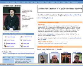
Screen shot of David Louis Edelman's MySpace pageHere’s the problem: MySpace is an abomination. Nothing works. The things that do work are poorly designed and shoddily implemented. Here’s just a small sampling of problems I’ve been having:

  • Member search doesn’t work. Try searching for members using multiple criteria, and watch the search go splat. (Then again, Yahoo’s member search has been broken for years and nobody seems eager to fix it.)
  • Importing contacts doesn’t work. I tried importing my online address books from Yahoo, GMail, and AIM. MySpace said it sent out a dozen or so invites. It didn’t, and I had to redo the whole thing by hand.
  • Instant messaging doesn’t didn’t work. I tried sending a friend a message just to see what it would do, only to receive a very unprofessional-looking error message stating that the instant messaging was out of commission.
  • Cross-posting from WordPress doesn’t work. I have managed to get this working with LiveJournal (http://david-l-edelman.livejournal.com if you’re curious) using a nice little plugin I found on the web. There used to be one of these for MySpace, but the plugin developer gave up because MySpace kept mucking with the API.
  • Reporting spam doesn’t work. This morning I received friend requests from kinkymonica, flirtymonica, and luvymonica. How do you report these friend requests as the porn spam they so obviously are? You can’t.
  • Approving your friends doesn’t work. I’m currently staring at my “approve/deny your friends” queue, which states that I’m looking at “Listing 1-6 of 6.” Only about an inch away, however, there’s another column that says “1 of 1.” And below, there’s nothing listed. Do I have five phantom friends? (Actually, that would explain a lot of things…)

To add to the functional problems, the site is full of the worst kind of design heresy. Boxes float around the page with seemingly no rhyme or reason. The default icons look like rejects from your old Windows 3.1 installation. Navigation seems to float around the screen in illogical places, to the point where the only button I can rely on is the browser’s Back button. Things get even worse when users start mucking with their MySpace designs and adding polls and plug-ins and garish animated GIFs. You get stuck with endless pages that take forever to load and are impossible to read.

Read more