Shelfari: LibraryThing with a New Coat of Paint?

LibraryThing seems to have a new competitor. Or, at least, I’ve just become aware of them.

I’ve made no secret about the fact that I’m a big fan of LibraryThing. I’ve spent hours and hours tweaking my LibraryThing profile, adding books to my catalog, and just browsing around other people’s shelves. I’ve spoken with Tim Spalding, LibraryThing’s founder, and he’s taken the time to respond to e-mails of mine and feature me on the LibraryThing blog once or twice.

So I felt a little like a cheating spouse when I responded to someone’s invitation to sign up for a Shelfari account last week. But it was actually much easier than cheating on a spouse, because I didn’t have to go through that whole tedious seduction and getting-to-know-you routine. I exported my whole LibraryThing catalog in about three clicks, and imported it right into Shelfari. In a way, it was like moving in with your mistress and skipping straight to the seven-year-itch all in one shot.

Here are screen captures of my catalog on LibraryThing and Shelfari, side by side. (Visit my shelf on Shelfari.)

LibraryThing screen shot Shelfari screenshot

After noodling around with Shelfari a little bit, here’s a synopsis of my thought process:

  1. The name “Shelfari” is incredibly lame.
  2. Shelfari looks slicker than LibraryThing.
  3. Shelfari is more user-friendly than LibraryThing.
  4. LibraryThing is fairly slick and user-friendly in the first place.
  5. So why would I switch to Shelfari?

The big difference between LibraryThing and Shelfari is that LibraryThing caps its free accounts at 200 books; Shelfari doesn’t appear to have any limits. But keep in mind that the LibraryThing rates are eminently reasonable. $10 a year for all you can catalog, or $25 for a lifetime membership.

Oh yeah, and Shelfari has a Facebook application. (I see that LibraryThing is testing out MySpace and LiveJournal widgets, which is cool, but IMHO they need to get cranking on a Facebook app.)

But there’s a huge amount of functionality that LT has which Shelfari doesn’t seem to have. I went browsing through “my shelf” on Shelfari and discovered that my copy of Shel Silverstein’s Where the Sidewalk Ends doesn’t have Silverstein listed as the author, only as the illustrator; and despite the fact that there’s an “Edit” link next to Edition Details, there doesn’t seem to be any way to edit that information. I was able to change editions to one which does have the author listed… but this one doesn’t have an illustrator listed. LT, by contrast, lets you edit book details to your heart’s content and upload custom covers that the whole community can use. Does the system think that “J.D. Salinger” and “JD Salinger” are two different people? Easy enough to fix that in LibraryThing.

Shelfari logoThis community focus is one of the things that makes LibraryThing so appealing. It’s kind of like — well, a library. It’s really, really easy to import and export your entire catalog so you can use it in other applications. Put it on your blog? Tie it in to your Firefox? Access it from your cell phone? No problem! If there are inaccuracies in the catalog, everybody pitches in to help fix it. If you read through the help menus and fine print, you’ll see quirky little bits of humor that give the site some attitude. “If the buzz page doesn’t convince you,” says a little blurb on the LibraryThing home page, “you cannot be convinced. Go away.” There’s a lack of commercial focus that’s very reminiscent of that library feeling. Come on in! Put your feet up, hang around as long as you like, buy some of the books on the Community Used Book table in the back if you’d like, but no pressure.
Read more

The End of MySpace

Ziff-Davis’ Baseline recently published an insider’s look at how MySpace functions on a technical level, and it’s quite revealing.

The common assumption among programming types about MySpace is that the system started off as somebody’s pet project and quickly mushroomed beyond the programmers’ control. Rather than cooling off growth to create a better infrastructure, the MySpace folks opted for growth at any costs. As a result, we end up with the buggy, unreliable usability nightmare that is MySpace today. Now, it’s assumed, the programmers and sysadmins are scrambling to play catchup.

This article pretty much confirms these assumptions. According to the article, MySpace started out as a ColdFusion-based project — and while ColdFusion is ridiculously easy to program, any developer can tell you it’s got a reputation (deserved or not) for being a little slow and resource-heavy on the performance scale. So as they’ve grown, MySpace has been moving to Microsoft’s ASP.Net and relying on emulators to port some of the older code over.

One can’t really blame MySpace for such logic. It’s the kind of hot-air logic that propelled companies like Pets.com to the stratosphere back in the ’90s and made a ton of people oodles and oodles of cash. It’s Web 1.0 thinking. Using such Web 1.0 thinking, MySpace has quickly vaulted to become the most visited site on the Internet and gotten snatched up by Rupert Murdoch’s News Corp. in the process.

But as a result, they’ve built on an unsustainable foundation. They’ve made the classic gamble that short-term gain will trump long-term stability. And like so many Web 1.0 companies that came before them, MySpace is headed for a big, clumsy fall. Here’s why.

  • Easy come, easy go. The base audience for MySpace consists of teenagers and folks in their twenties. That’s not to say this is the only demographic using MySpace, but that’s the core audience. These people flocked to the service for the same reasons young people flock to anything: it was new, it was cool, it was free, and everyone they knew was doing it. Give them an alternative that’s newer, cooler, better functioning, and more reliable — not to mention backed by big corporate dollars — and they’ll flock there just as quickly.
  • Insecurity. Recently someone came up with the grand idea of distributing malicious code through a security vulnerability in embedded QuickTime videos. Folks have been taking advantage of CSS and HTML quirks to hack MySpace almost since the place began. More and more people are complaining about hacked profiles and hijacked identities. MySpace has demonstrated time and again that they’re behind the curve when it comes to security. So I think it’s highly likely that at some point in the near future, we’ll see a series of successful crippling attacks on MySpace that will send people running in a panicky exodus.
  • Slowing pace of innovation. Adapt or die, that’s the unofficial motto of the Internet. And unlike, say, Google, which continues to pump out features and applications by the gallon, MySpace has remained largely sedentary for the past year. They released a lamentable, old-school IM client and better video integration, but otherwise the system is pretty much the same as it was 18 months ago. As MySpace’s technical problems grow and their folks spend more and more time just keeping up with demand, they’re going to fall even further behind.

    Read more

coComment Does Web 2.0 Right

Despite last week’s rant about too much web 2.0 hype, I’ve made one discovery recently that’s made my life a lot easier. It’s called coComment. coComment keeps track of all the comments you make on blogs throughout the web so you don’t have to go Googling for them yourself.

Meta-ing Ourselves to Death

I’m starting to get that dot-com bubble burst feeling again. There are too many meta information tools out there with shaky revenue streams.

Why Does MySpace Suck So Badly?

In an effort to spread the word about my book Infoquake, I’ve been experimenting with several social networking services. I now have a LiveJournal that cross-posts what I post here, I’ve got a space at MySpace, I’m linked in to LinkedIn.

MySpace is far and away the most popular of these types of services. According to Alexa, MySpace ranks only below Yahoo and Google in terms of popularity on the web. If you’re curious, you can view my page at http://www.myspace.com/davidlouisedelman.

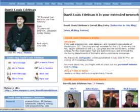
Screen shot of David Louis Edelman's MySpace pageHere’s the problem: MySpace is an abomination. Nothing works. The things that do work are poorly designed and shoddily implemented. Here’s just a small sampling of problems I’ve been having:

  • Member search doesn’t work. Try searching for members using multiple criteria, and watch the search go splat. (Then again, Yahoo’s member search has been broken for years and nobody seems eager to fix it.)
  • Importing contacts doesn’t work. I tried importing my online address books from Yahoo, GMail, and AIM. MySpace said it sent out a dozen or so invites. It didn’t, and I had to redo the whole thing by hand.
  • Instant messaging doesn’t didn’t work. I tried sending a friend a message just to see what it would do, only to receive a very unprofessional-looking error message stating that the instant messaging was out of commission.
  • Cross-posting from WordPress doesn’t work. I have managed to get this working with LiveJournal (http://david-l-edelman.livejournal.com if you’re curious) using a nice little plugin I found on the web. There used to be one of these for MySpace, but the plugin developer gave up because MySpace kept mucking with the API.
  • Reporting spam doesn’t work. This morning I received friend requests from kinkymonica, flirtymonica, and luvymonica. How do you report these friend requests as the porn spam they so obviously are? You can’t.
  • Approving your friends doesn’t work. I’m currently staring at my “approve/deny your friends” queue, which states that I’m looking at “Listing 1-6 of 6.” Only about an inch away, however, there’s another column that says “1 of 1.” And below, there’s nothing listed. Do I have five phantom friends? (Actually, that would explain a lot of things…)

To add to the functional problems, the site is full of the worst kind of design heresy. Boxes float around the page with seemingly no rhyme or reason. The default icons look like rejects from your old Windows 3.1 installation. Navigation seems to float around the screen in illogical places, to the point where the only button I can rely on is the browser’s Back button. Things get even worse when users start mucking with their MySpace designs and adding polls and plug-ins and garish animated GIFs. You get stuck with endless pages that take forever to load and are impossible to read.

Read more

Book-Geekity Fun with LibraryThing

I love snooping at other people’s libraries. Whenever I’m at someone’s house, you’ll usually find me with my head tilted to one side reading book jacket spines within the first ten minutes of walking in the door. I’ve been known to walk through IKEA paying much more attention to the books on the shelves than to the shelves themselves. So imagine my excitement when I discovered LibraryThing. LibraryThing is basically a connected online database of … Read more

The Joy of Strict XHTML

I’ve recently discovered something else the Mozilla Firefox browser can do that Microsoft’s Internet Explorer can’t: Firefox can accept documents using the “application/xhtml+xml” header.

Who gives a shit? you might be thinking to yourself. Wait, I’ll explain. This might actually change your life someday.

For years, people have been writing web pages using the dated and somewhat arbitrary HTML 4 specification. If you don’t know what HTML looks like, take a look at the source code on any web page (by going to the “View” menu and selecting “Page Source” in Firefox or “View Source” in IE).

The problem is that during the web browser wars of the ’90s, Microsoft and Netscape both decided that they wanted their browsers to be as inclusive as possible. You could be a sloppy or an amateur coder, make all kinds of errors in your HTML, and the browser would silently compensate for you. For instance, the proper way to create a bulleted list is by using this code:

<ul>
<li>apples</li>
<li>oranges</li>
<li>bananas</li>
</ul>

But you could just as easily get away with typing this instead:

<UL>
<Li>apples
<li>oranges<lI>
<li>bananas
</ul></Ul>

Read more