Share This: A WordPress Plug-in

[Quick reminder before we get underway: my Jewish Marxist Werewolves in Bolivia Infoquake giveaway contest is still open! Deadline is this Friday, and lots of opportunity for you — yes, you — to win a signed copy of the book.]

I’ve nearly completed all the modifications I wanted to make on this blog for 2007. Finally this weekend I cleared one of the last remaining hurdles: a good hook to social bookmarking and Web 2.0 sites.

I found that hook with Alex King’s Share This plug-in for WordPress.

Screen shot of Alex King's 'Share This' plug-in

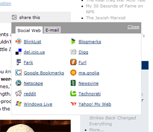
Look at the gray bar underneath the headline of any article on this site. Along with “permanent link,” “comments,” and “trackback,” there’s now a “share this” link. Click it and give it a whirl. (If you’re viewing this article on LiveJournal, MySpace, or SFNovelists, you can look at the screen shot to the right instead. Or view this article on my WordPress blog.)

The Share This plug-in is a godsend, because it eliminates the bane of so many blogs and websites these days: the growing clutter of Web 2.0 link buttons. We’ve all seen them. They’ve spread throughout the footers and sidebars of the World Wide Web like kudzu. Alex’s plug-in takes the whole kit-n-caboodle and tucks it nicely in a dynamic pop-up. Look, ma, no mess!

The list is fairly easy to configure if you’re comfortable editing a well-commented PHP document. You can use the list of other social web-type services found on 3spots’ list of blog footer buttons. Obviously I don’t have accounts with all these services, so all y’all blog readers will have to let me know if there’s a button that’s misbehaving. And let me know if there are any services I’m missing.

So far, the plug-in seems to be working extraordinarily well, and I can only hope it will allow my blog to continue to grow and dominate the blogosphere. Perhaps next year, I’ll look back at all the rival bloggers I’ve mercilessly slain on the field of Technorati and have Alex King to thank for it. (Hopefully Mr. King will even forgive me for grayscaling his nice standardized share icon.)

Of course, there’s always room for improvement, so I’m going to throw in my two cents about things I’d add or change in the plug-in.

Read more

Why Is Gmail So Irritating?

I switched over to Google’s Gmail about a year and a half ago from Yahoo! Mail, mostly because I wanted a change. I’m on Gmail about half of the time now, while the other half of the time I use Microsoft Outlook 2003.

I like Google. I have great faith in their ability to bring new technology to the masses in an intuitive, highly functional package. Google Maps quickly supplanted MapQuest as my street directory of choice when it came out. And I’ve got high hopes for Writely, an online word processing application that Google bought earlier this year and promptly rechristened Google Docs & Spreadsheets.

So why is Gmail so irritating?

Gmail logoGmail should be a slam-dunk for Google. After all, I can build a simple POP3 application on a ColdFusion web server in a couple of hours, and that includes time for me to consult the Macromedia documentation to fix my mangled CFML syntax. I’m not saying that that’s all there is to it, of course. (If you want to see a ColdFusion-based application gone horribly awry, look at all the flaws in MySpace.) But I don’t have some of the world’s best developers and billions of dollars in cash lying around either.

Here are my major problems with Gmail:

  • Gmail breaks the browser Back button. To me, this is an absolute cardinal sin. Yes, I understand how difficult it is to make a functioning web application that obeys the Back button in a stateless environment like the web. But certainly Google can do better. I back up into blank, non-functioning pages at least two or three times a day, usually when following links from the Gmail module on my Google home page. And when Google isn’t breaking the Back button, they’re opening up new and unwanted tabs in my browser.
  • Gmail breaks the Reload/Refresh button. Try opening an e-mail message, and then hitting your browser’s reload/refresh button. You get taken back to the list of e-mails. I get hung up on this several times a day too.
  • The interface is very, very slow. I lose patience very easily with the “Loading” messages that pop up at the top of the screen — there are actually two different messages, one that appears in the top right and one that appears in the top left — and they’re up there a lot.
  • No folders. Google assumes that we don’t care for the convention of filing our e-mail into different folders. Therefore Gmail does away with this metaphor altogether in favor of its own Label system, which I can’t seem to get used to. Couldn’t they at least give you the option of using folders, even if it’s not set by default?

Read more

A New Look for the Blog

You may notice that something looks a different on this website today. It’s a new theme for the blog that I’ve been tinkering with for the past couple months. So after much fiddling around in Photoshop, Dreamweaver, and WordPress, I’m ready to debut it to the world (though I might decide to revert back to the old one temporarily until I fix some of the kinks).

Why a new theme?

  • I wanted to make the blog a little more colorful and less visually boring
  • I wanted to display more information without sacrificing usability
  • I wanted to take out some of the old blog features and add some new ones

Some of the new features you’ll notice on the blog include:

  • Permanent links to the comments section of each article, and permanent links to each individual comment
  • Numbered comments that are a little easier to follow
  • Lefthand column with links to all my various websites, including stuff like my Flickr and MySpace pages
  • Slightly cleaner HTML behind the scenes
  • RSS feeds now show article summaries, not just the first paragraph of the article
  • A corner of rotating photos of Yours Truly

I’m a bit of a perfectionist, though, and so there are a number of things that I’m not quite satisfied with. Among those:

  • The top column is a little too cramped to accommodate the pictures in the posts that have them. (See this post and this post.) The all-text posts have a much cleaner look. (Update: Cleaned up most of the posts that were causing problems.)
  • The Infoquake promotional box in the left column doesn’t feel like it’s in the right place.
  • I messed up the CSS somewhere along the way, and as a result the left margin of the central column is two or three pixels off in some places. (Update: Fixed.)
  • The “Next Entries” and “Previous Entries” navigational links need graphical icons. (Update: Fixed.)
  • The footer doesn’t always land in the right place. Sometimes it’s too far down.
  • There should be a little bit more white space, especially at the top of the page where the sidebars live. (Update: Fixed.)
  • I need to add the coComment integration scripts back in. (Update: Fixed.)
  • I don’t like how the list of allowed tags in the comments box looks. Too cluttery. (Update: Fixed.)
  • The Firefox AdBlock extension blocks out the navigational icons in the link bar at the top of every article.
  • I still need to find a place for my blogroll. Ideally I’d like a sidebar box that displays 10 random links from a much longer list of friends and favorites, along with a link to the complete list. That way you wouldn’t have to wade through those interminable and unreadable blogrolls that include everybody in the Western hemisphere. (Exhibit A.) (Update: Fixed. Also, see Exhibit A (Teresa Nielsen Hayden)’s comments below.)

Read more

coComment Does Web 2.0 Right

Despite last week’s rant about too much web 2.0 hype, I’ve made one discovery recently that’s made my life a lot easier. It’s called coComment. coComment keeps track of all the comments you make on blogs throughout the web so you don’t have to go Googling for them yourself.

Why Does MySpace Suck So Badly?

In an effort to spread the word about my book Infoquake, I’ve been experimenting with several social networking services. I now have a LiveJournal that cross-posts what I post here, I’ve got a space at MySpace, I’m linked in to LinkedIn.

MySpace is far and away the most popular of these types of services. According to Alexa, MySpace ranks only below Yahoo and Google in terms of popularity on the web. If you’re curious, you can view my page at http://www.myspace.com/davidlouisedelman.

Screen shot of David Louis Edelman's MySpace pageHere’s the problem: MySpace is an abomination. Nothing works. The things that do work are poorly designed and shoddily implemented. Here’s just a small sampling of problems I’ve been having:

  • Member search doesn’t work. Try searching for members using multiple criteria, and watch the search go splat. (Then again, Yahoo’s member search has been broken for years and nobody seems eager to fix it.)
  • Importing contacts doesn’t work. I tried importing my online address books from Yahoo, GMail, and AIM. MySpace said it sent out a dozen or so invites. It didn’t, and I had to redo the whole thing by hand.
  • Instant messaging doesn’t didn’t work. I tried sending a friend a message just to see what it would do, only to receive a very unprofessional-looking error message stating that the instant messaging was out of commission.
  • Cross-posting from WordPress doesn’t work. I have managed to get this working with LiveJournal (http://david-l-edelman.livejournal.com if you’re curious) using a nice little plugin I found on the web. There used to be one of these for MySpace, but the plugin developer gave up because MySpace kept mucking with the API.
  • Reporting spam doesn’t work. This morning I received friend requests from kinkymonica, flirtymonica, and luvymonica. How do you report these friend requests as the porn spam they so obviously are? You can’t.
  • Approving your friends doesn’t work. I’m currently staring at my “approve/deny your friends” queue, which states that I’m looking at “Listing 1-6 of 6.” Only about an inch away, however, there’s another column that says “1 of 1.” And below, there’s nothing listed. Do I have five phantom friends? (Actually, that would explain a lot of things…)

To add to the functional problems, the site is full of the worst kind of design heresy. Boxes float around the page with seemingly no rhyme or reason. The default icons look like rejects from your old Windows 3.1 installation. Navigation seems to float around the screen in illogical places, to the point where the only button I can rely on is the browser’s Back button. Things get even worse when users start mucking with their MySpace designs and adding polls and plug-ins and garish animated GIFs. You get stuck with endless pages that take forever to load and are impossible to read.

Read more

Web Hosting Companies That Suck

Web hosting companies have a reputation for service that ranks right up there with the cable and phone companies. In other words, execrable.

This is one case where the reputation is in line with reality. Web hosting companies, on the whole, suck.

One can feel some sympathy for the people running a web hosting business; it’s not an easy thing to do. You’ve got to keep web servers up and running over 99% of the time, even during a storm or a power fluctuation. You’ve got to have adequate security to keep out denial-of-service attacks and data thieves. And you’ve got to have the patience to deal with customers who simply don’t know what the hell they’re doing.

Granted that it’s not an easy business, but one must still expect a minimum level of competence. Nobody forced these people to get into web hosting. You don’t pop the key into the ignition of your Toyota and, when the damn thing doesn’t start, tell yourself that it’s okay because building a good car is hard.

I’m not sure what the margins are like on web hosting. But I can’t imagine they’re all that impressive — who can make money running a technical service on $5.99 a month? Big corporations like Dell and Yahoo! just throw up their hands at the whole thing, or they change their business strategy every two months, presumably because the service still blows.

So here I am, with twelve years of web design and programming experience under my belt, and I still can’t find a reliable web host.

This post was spurred by a bad experience I had recently with GoDaddy, which is more well-known as a domain registrar. I spent close to two hours on the phone (long distance) with GoDaddy technical support trying to figure out why the server wouldn’t create a ColdFusion search collection on one of my clients’ websites. (This isn’t a particularly arduous task; it’s literally one line of code.) GoDaddy’s first conclusion: your one line of basic code must be wrong. Their second conclusion: we can’t answer this question until you pay an upfront fee of $300 for our “advanced” technical support. Their final conclusion: sorry, GoDaddy doesn’t support basic ColdFusion searching.

Read more

The Joy of Strict XHTML

I’ve recently discovered something else the Mozilla Firefox browser can do that Microsoft’s Internet Explorer can’t: Firefox can accept documents using the “application/xhtml+xml” header.

Who gives a shit? you might be thinking to yourself. Wait, I’ll explain. This might actually change your life someday.

For years, people have been writing web pages using the dated and somewhat arbitrary HTML 4 specification. If you don’t know what HTML looks like, take a look at the source code on any web page (by going to the “View” menu and selecting “Page Source” in Firefox or “View Source” in IE).

The problem is that during the web browser wars of the ’90s, Microsoft and Netscape both decided that they wanted their browsers to be as inclusive as possible. You could be a sloppy or an amateur coder, make all kinds of errors in your HTML, and the browser would silently compensate for you. For instance, the proper way to create a bulleted list is by using this code:

<ul>
<li>apples</li>
<li>oranges</li>
<li>bananas</li>
</ul>

But you could just as easily get away with typing this instead:

<UL>
<Li>apples
<li>oranges<lI>
<li>bananas
</ul></Ul>

Read more

Miscellaneous Web Design Sins

Chances are, if you’ve put together a website, you’ve committed some (or all) of these venal sins. Or your clients have made you commit them. Hyperlinking the words “click here.” People generally don’t read websites in the way they read a book or a magazine; they skim. And when you hyperlink contentless words like click here, the user gets lost in a sea of “click here”s. You can’t tell where the link goes without reading … Read more

The Importance of Web Conventions

I’m looking forward to seeing the galleys for my novel sometime in the next few months. Pyr has decided to implement a lot of special features in the book design. Page numbers won’t be in the top or bottom margin as you might expect, but right in the middle of the text. And since readers get bored constantly reading text from left to right, my editor decided to make the text direction vary on each … Read more