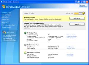
It’s pretty much official at this point: Microsoft is ditching program menus.
By program menus, I mean that narrow bar at the top of every program in MS Windows which usually starts with “File” and ends with “Help.” These menus have been a part of day-to-day computing experience since the first Macs in the ’80s, and have a history that extends back to Xerox PARC in the early ’70s. And now Microsoft is putting them out to pasture.
I’ve got several of the new breed of Vista-related betas installed on my desktop — Internet Explorer 7, Windows Media Player 11, Windows Defender, and Windows Live OneCare — and the menus are tucked away in places where the ordinary user isn’t likely to encounter them. In IE7, you need to click on the Tools icon and select “Show Menu Bar” in order to see them. Windows Media Player makes things even more difficult; unless you want to dig through the multi-tabbled Preferences window, you need to right-click on a blank patch in the top or bottom of the screen and select “Show Classic Menus.” Defender and OneCare lack menus altogether. Look ma… no program menus!
Is this a good thing or a bad thing?
 I can see what Microsoft is trying to accomplish, and in theory it’s a laudable goal. Microsoft is trying to change the standard paradigm of users commanding their software; instead they’re creating software that pre-emptively responds to users. Instead of hunting for the command to Burn a CD in the menus, the software should anticipate that you might want to burn a CD and present the option in a big shiny button that’s hard to miss.
Software is growing more complex every year, and the day is rapidly approaching when it will be ridiculously unwieldy to try to wedge every little bell and whistle for Microsoft Word into seven or eight menus. Already you need sub-menus and sometimes sub-menus scrolling off of those sub-menus. Clearly the software needs to grow more intelligent about what the user wants.
But here’s the problem: the software doesn’t always anticipate what you want. Then what?
Windows Media Player is a good example. It’s a relatively chunky piece of software that lets you rip music from CDs, burn music to CDs, sync music to mobile devices, organize your music, etc. Most of the basic features are pretty intuitive, to Microsoft’s credit, and although the program isn’t particularly speedy, it’s plenty stable.
But there are a number of annoying little things that I just can’t figure out how to do. For the longest time, I would select a group of songs in an album, right-click and select “Play,” expecting them to play in order. But no — the songs would inexplicably shuffle into a random order. There’s nothing in the right-click menu that indicates these songs should be shuffling. So I learned to select “Add to Now Playing” instead of “Play.” Which worked fine most of the time, except sometimes the list in the right-hand side wouldn’t change over to show the Now Playing list for some reason, and I’d have to switch views to edit it.
The point is, without an orderly system of menus, we’re back to trying to figure out the logic of each program one at a time. We no longer have the simple mnemonics of “File/Print” or “Tools/Options” to guide us. And I bet that this lack of uniformity will hurt user productivity more than the menu clutter did in the first place.
I applaud the effort for software to anticipate what we want to do, and I look forward to seeing how good software can get at this. In fifty years, I’m betting that we won’t need program menus. But in the meantime, software programs should have an easily accessible index of commands. Maybe this could be a standard button that appears in the top right of every program, next to the question mark for help. And you’d be able to click on this button and get an alphabetized list of commands. I can’t think of any program offhand that has a feature like this, but it’s sorely missed.
Oh, and the shuffling thing? It turns out that there’s a button on the bottom of Windows Media Player with three parallel lines that turns shuffling on and off. The button isn’t labeled, and I don’t ever remember turning it on. Isn’t that intuitive?
Sigh. And so we beat on, boats against the current, borne back ceaselessly into the past.